Getting Started with Birchills Phone Analytics
What is Birchills phone Analytics?
Analytics gives you the ability to dig into the data behind your business phone system. You can use our pre-built charts to visualise your data, or build your own charts and dashboards to meet your exact needs. You can access the Analytics page by clicking the grid icon on the top right of the dashboard. 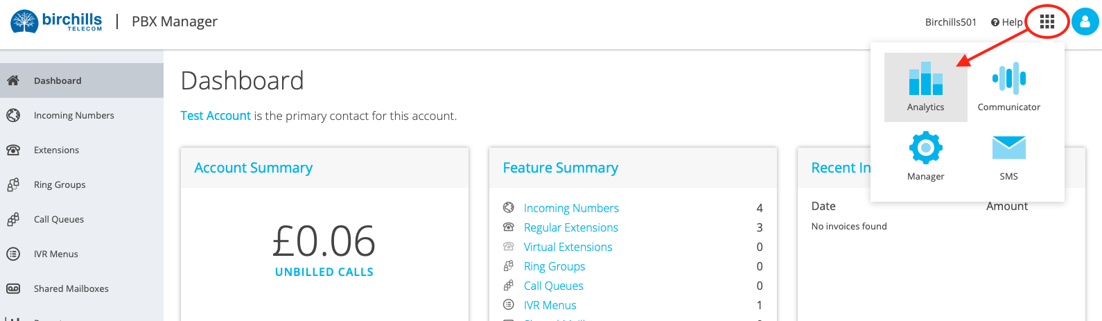

Exploring the Default Dashboard
When you first launch Analytics you'll be greeted with your Default Dashboard, which features a set of predefined charts showing a variety of data about your phone system. 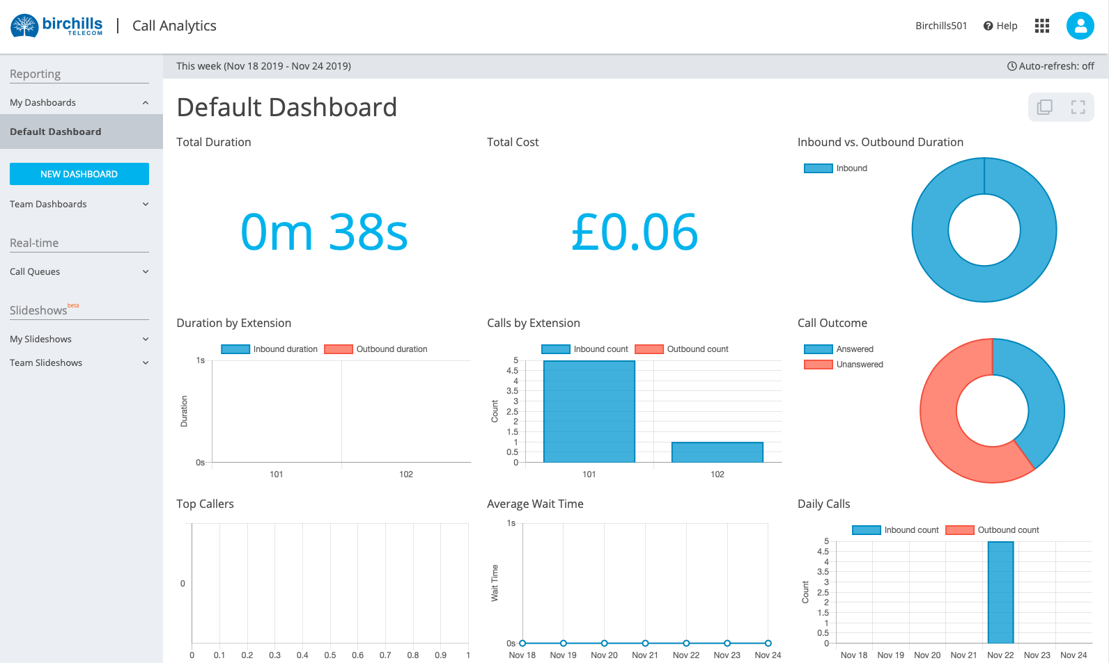

While the Default Dashboard is great for a general overview of your phone system, Analytics gives you the power to build your own charts and data visualisations, allowing you to tailor your dashboards to your needs.
A great place to start building your own dashboard would be to duplicate the Default Dashboard and edit that to fit your needs, so that's where we'll start.
Start off by pressing NEW DASHBOARD in the sidebar and selecting Default Dashboard in the Create from a template? dropdown. At this point you can also give your dashboard a name, and choose whether or not it should be visible to other members of your team, or only to you. Don't worry though, you can come back and change either of these settings later. For now, let's name the new dashboard My Dashboard and set it to private.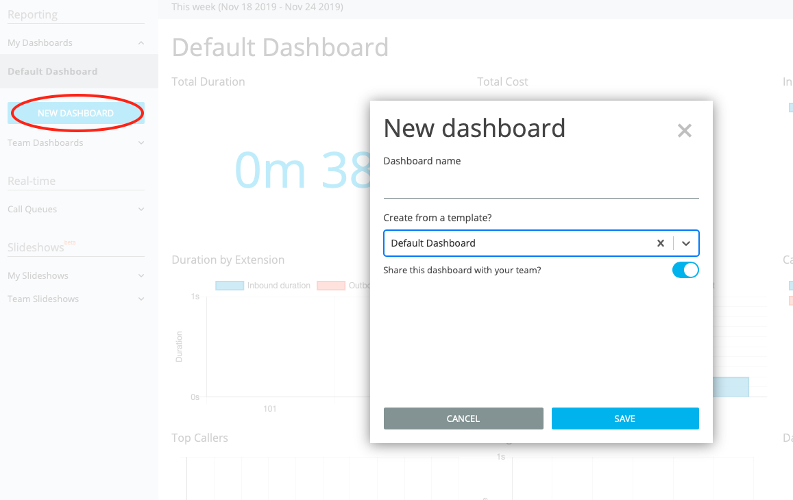

Oce you've done that, you'll see your new dashboard added to the list of dashboards in the sidebar.
Next, press the pencil icon in the top right of the new dashboard turn on edit mode so that you can make changes. You'll now be able to inspect each chart to see the settings used to create it, as well as create your own new charts. 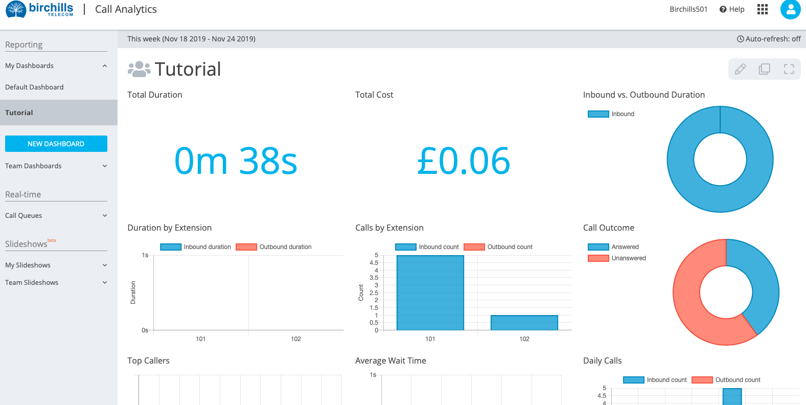

Settings
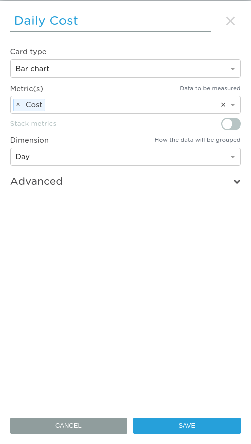
If you add a new chart, or edit an existing one, you'll be greeted with a list of settings. Although these settings may seem overwhelming at first, you'll be flying through them in no time. Here's a breakdown of what each setting does.
| Setting | Description | Example values if relevant (not exhaustive) |
| Card type | The type of chart to use for the card.
|
Bar chart, Pie chart, Number
|
| Metric(s) | A metric is the set of data that you'd like to display. Every chart requires at least one metric, but can have more if it makes sense.
|
Total cost, Average duration, Inbound count |
| Stack metrics | If you're using multiple metrics on a bar chart, enabling this option will combine those metrics into a single stack. | |
| Dimension | Dimensions let you specify how you'd like to break your data down. Most charts require a dimension to be set.
|
Hour, Day, Week, Call direction, Call outcome |
| Call direction | Filter by call direction. | All, Inbound, Outbound |
| Call scope | Filter by call scope. | All, Internal, External |
| Endpoint type | Filter by endpoint type. | All, Extension, Queue, IVR |
| Specific endpoints | Filter by one, or multiple, endpoints. | John <107>, Main Queue <305> |
| Sorting | Sort the X-axis by the chosen metrics. | Cost ascending, Duration descending |
| X-axis label | An optional label for the X-axis. | |
| Y-axis label | An optional label for the Y-axis. | |
| Show series legend | Show or hide the legend. | |
| Legend position | The position of the legend on the chart. | |
| Start Y-axis at 0 | Start the Y-axis at 0, or closer to the start point of your data. | |
| Display raw labels | Display labels in their raw, unformatted form. |
Daily Cost Chart
Let's have a closer look at how some of the charts on the default dashboard were created. We'll start with the Daily Cost chart.
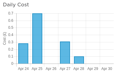
The main settings used to create this chart are as follows.
| Setting | Value | Description |
| Card type | Bar chart | It makes sense to use a bar chart, as the chart is displaying several discrete data points.
|
| Metric(s) | Cost | As the chart only displays cost, it can simply use Cost as it's only metric.
|
| Dimension | Day | The chart is breaking down the cost of calls per day, so it uses the Day dimension. |
This specific chart also has the Y-axis label set to show the correct units on the Y-axis, although that is completely optional.
Creating a new card
Now that we've explored how pre-existing cards are created, we can look at creating a new card from scratch. We'll be creating a Call Duration by Day chart which will show the total call duration by day, split into inbound and outbound calls.
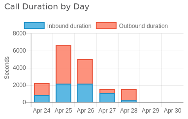
Click the pencil icon on the dashboard to enter edit mode, and then press the add icon at the bottom of the dashboard to add a new card. Name the new card Call Duration by Day. The settings we'll use are as follows.
| Setting | Value | Description |
| Card type | Bar chart | We will use a bar chart so that we can stack the Inbound duration and Outbound duration on top of one another.
|
| Metric(s) | Inbound duration, Outbound duration | If we use two metrics, Inbound duration and Outbound duration, we can combine them to create a single bar showing total duration, split into inbound and outbound calls. |
| Stack metrics | Enabled | We want to combine the two metrics into a single bar on the bar chart.
|
| Dimension | Day | The chart is breaking down the duration of calls per day, so it uses the Day dimension. |
| Y-axis label | Seconds | Make it clear that the chart is measuring duration in seconds. |
That's everything that's needed to create the Call Duration by Day chart, the rest of the settings can just be left as their default values. Press the save button at the bottom of the settings pane, and then press the save icon in the top-right of the dashboard to finish.
If you'd like any help building charts on your dashboard please don't hesitate to get in touch!